
Updated for 2023
A lot has changed since we first sat down to write this article. Mobile responsive web has pushed even further into every day ecosystems with mobile phone website usage now at around 60% of all devices. That’s huge, and a big jump from 2016’s 44.5% (when we originally wrote this article) and even more so than this time 10 years ago, which saw mobile phone webiste usage sitting at around 12%.
What does this mean for the web and for your website? On the surface level it tells us that 6/10 sessions are now from a mobile. People are leaning into that accessabilty, making more and more decisions from the comfort of their couch in the evening or while on a bus or just making the most of that spare 5 minutes.
Society has become ever quickening and people have gotten used to instant feedback. Research suggests our attention spans have decreased rapildy since the early 2000’s with the average attention span in 2000 being 12 seconds, in 2018 this was reduced to 8.25. So you can imagine how this number sits today.
Responsive Web Design is a term you might hear from time to time when researching web development. You might also have comes across Adaptive Web Design. There are many aspects to RWD (Responsive Web Design) that can better inform you and help you understand how being compliant with these practises can help your Business. In the following post we’ll walk through some of the different components that make up responsive web design and identify what exactly it is, makes it such an essential practise.
People will spend less than a few seconds on your website so it’s crucial that the experience is comfortable, fast and intuitive. In the all devouring consumer driven environment we live in having a responsive website that delivers on speed and accessabilty is crucial. If you would like to discuss optimising your website or starting a new project the click below 🙂
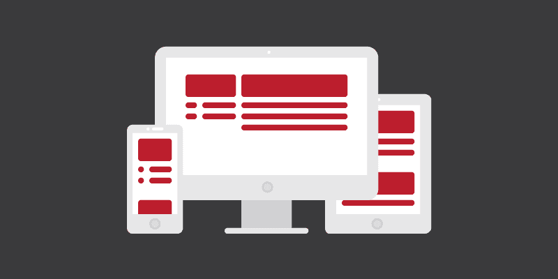
Responsive Web Design versus Adaptive Web Design
When we talk about responsive web design we’re taking the naming convention literally. Responsive web elements are just that – your design should respond to it’s environment. Both practises ultimately achieve the same goal (displaying across multiple devices and platforms) it’s the action of achieving this goal that differs. Responsive Design is one design element that responds to changes in it’s environment, it consists of one structural layout along with the relative CSS (Cascading Style Sheets: What designers and developers use to establish design within their website) taht defines the fluidity and look of the element(s). Responsive Web Design uses one rule of design to manipulate content when the device it’s being viewed on changes.
Adaptive Web Design on the other hand has set Designs and CSS for each potential view-port (Phone, Tablet, Small Laptop extra) – so instead of being responsive to it’s environment, it merely adapts to a view-port based on pre-determined design and code structure. Both philosophies have there place and are essentially the same idea but it’s important to understand the differences. Responsive Web Design would be water in it’s base form; fluid and able to expand and contract to suit it’s environment. Adaptive on the other hand would be Ice, a more rigid structure that requires certain existing areas to accommodate it.

Relative Units
When we talk about relative units we refer to the percentage declaration. Pre responsive web design you would often see elements being declared in pixel width, of course to some extent this is still in practise today but for the most part responsive elements work within the percentage variable.
What does this mean though? Well, as an example, if we have a container element and give it a with of 1000px, that container is set to said numerical value across all displays. So on a mobile phone, with a possible display of 320px (max width) our 1000px container is going to bleed off the screen. So what’s the difference in using percentages then? If had given our container a width of 100% or a max-width of 100% then we’re telling the element to occupy 100% of the space relevant to it’s display. So on that mobile phone we talked about, our 100% width container would display at the max capacity of the phone, which was 320px.
Using percentages for child items insures the values applied work towards their parent item, in the case above the container is a child of the screen width(parent) so setting it’s width to 100% instead of 1000px means the container occupies the space available to it.

Break Points
Break points are when your design changes to accommodate a registered platform. You typically see this by manually resizes your browser window on your PC or Laptop. When you begin to encroach upon a break point the content / design will change to accommodate it’s new surroundings. You may only see minor changes to the design on larger screens, but once you begin to close in on tablet and phones you will notice the core design of your website (if it is responsive) change. The points at which these changes take place are noted as break points and essentially mean at which point your pre-determined design will change for optimal viewing on smaller devices.

Mobile / Desktop First
Mobile or Desktop first dictates what direction your design philosophy has gone in. Whether you’ve designed with Desktop in mind and consequentially adhere to Mobile standards or whether you’ve prioritised Mobile content, and designed around that instead. The idea and core principles are much the same either way, whatever way you plan to build your website it should scale accordingly – be it from Desktop down to Mobile devices or vice-versa. Having a design that facilitates the content on any platform is paramount.

The Fold / Flow
You’ll often hear people discussing content on (specifically) their website homepage, and more importantly how they are prioritising the most important content. The fold and flow relates to where content is in relation to the scrolling point on the display. Above the fold content is content that is visible on your website without having to mousewheel to view it. This usually means that you will want to keep important information above the fold such as a call to actions, announcement type content, contact information and/or service details.