In this article entitled ‘What Font Should I Use For My Logo Design’ we give you the lowdown on which typefaces suit your brand. Choosing a suitable font for your logo is imperative in communicating what your brand is about and how it is perceived. There are five main categories that fonts fall into, including serif, sans serif, handwritten, script and display fonts. Below we explain what each is and how they should be used.
Serif Fonts:
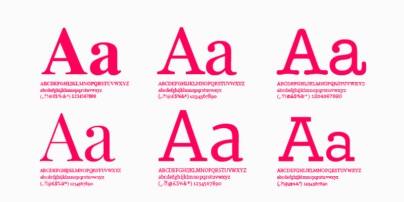
Serif fonts are recognised by decorative lines that are added to embellish the basic form of the character. A prime example of a serif font is Times New Roman. Serif typefaces are seen as traditional fonts mainly used in print accounting to their superior legibility on the printed page. They portray a classic style of professionalism that one would associate with solicitor, accountant, financial institute, etc. Prime examples of logos using Serif Typefaces include Sony, Volvo and Heineken.
Sans Serif Fonts:
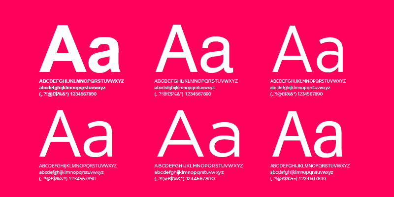
Sans Serif fonts are basically a more paired back version of their serif counterparts. Unlike serif, San Serif typefaces don’t use decorative lines to embellish each character. A prime example of a Sans Serif font would be Helvetica. Sans Serif is regarded as a minimalist typeface that is predominantly used online. This type of font is regarded as a modern typeface that one would associate with the technology sector or progressive industries. Prime examples of logos using Sans Serif Typefaces include Google, Spotify and Ebay.
Handwriting Fonts:
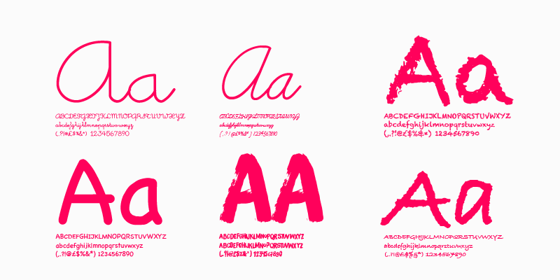
Hand written fonts are typefaces that mimic a cursive style of writing. A prime example of this style is Pacific Northwest. Handwritten fonts are seen as human, uplifting and warm. This style is often associated with creative, fun brands such as clothing, the arts, etc. Prime examples of logos using Handwritten Typefaces include Harrods, Virgin and Barbie.
Script Fonts:
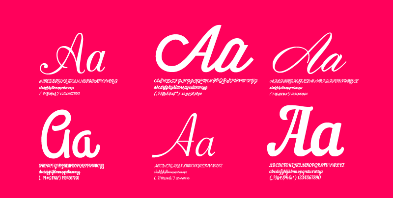
Script fonts are elegant typefaces that are essentially finely tuned handwritten compositions. A prime example of this style of font is Wisdom Script. Script fonts are associated with luxury products or fancy events. Prime examples of logos using Handwritten Typefaces include Ford, Johnson and Johnson and Kleenex.
Display Fonts:
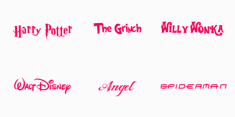
Display fonts are typefaces that are custom made for specific logos. The font itself is often not a complete character set. A prime example of Display fonts used in logo design is Will Wonka, Spiderman (Movie) and The Grinch.
What Font Should I Use For My Logo Design
Most importantly you should choose a designer with a proven background in logo design! Upon finding your Knight in shinning armour, you have four considerations to carefully consider:
- Responsive Typeface: Make sure that the typeface you are choosing works comfortably in print and online using desktop, tablet and mobile devices.
- Be Timeless: Don’t be tempted to rely on design trends. The disadvantage of this is ending up with a logo that looks dated in a matter of years.
- Keep it Simple: Don’t have an overly complicated typeface if you expect it to be legible in the size of a stamp!
- Use Space: A cramped logo typeface can be hard to read. Make sure there is enough room to allow the font to communicate with the viewer.
For any more information regarding our article on What Font Should I Use For My Logo Design or to avail of our services please call Opus Creative on +353 (21) 242 8689 or email us on hello@opuscreative.ie

