On February 9th the English Premier League launched their new logo to the public. Public opinion online was mixed at best with a lot of people resistant to new more flexible design. In this article we give you the lowdown on the New Premier League Logo Design Review.
Why Have the Premier League Updated their Logo
In the forth coming 2016/17 Premier League season a new identity will be released across all online and printed platforms. With the sponsorship model scrapped the league will simply be known as the ‘Premier League’, removing the need for a sponsor incorporated dual logo. The company behind the rebrand, the Design Studio released a press release stating that they aimed “to create a bold and vibrant identity that includes a modern take on the lion icon.”
Design Studio founder, Paul Stafford stated that they took “a fresh, new take on the iconic Lion, we’ve created an identity that’s purpose-built for the demands of the modern world. While staying true to the Premier League’s history and heritage”. This means the identity was updated to work across all media platforms, both in print and online to allow the identity to be used from a thumbnail size right up to a billboard. The previous logo could not be inverted or reproduced in a small format.
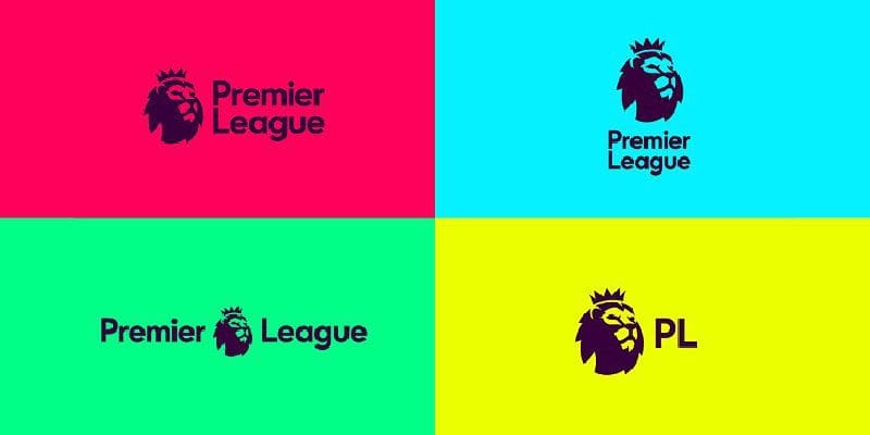
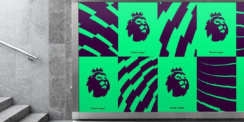
The new identity has retained aspects of the iconic lion, while taking a more modern approach to typography and colour. Typographically the new identity has replaced the serif typeface with a friendlier custom sans serif font. The new bespoke font aptly named Premier League will soon be released to be incorporated throughout the brand. The colours were designed to be replaced every three to four years with brighter and more friendly palettes being used to highlight the more human side of the organisation. The colours themselves we purposely picked not to be similar to any of the competing teams, thus remaining unique and entirely neutral.
Responsive
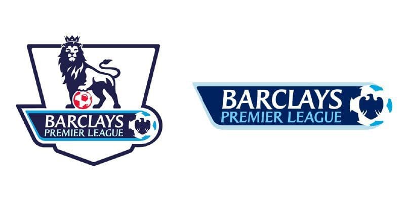
The release of the new Premier League identity has been long overdue. The existing logo has three major faults, firstly the logo cannot be inverted without losing the intended aesthetic, secondly it can’t be produced in smaller sizes legibly and finally it is hamstrung by the need for two identities with and without the sponsor. What the new logo does immediately from a functional point of view, is it eradicates these flaws and allows the logo to be responsive across all sizes and platforms. The logo is able to be reproduced ledgibly from a very small size right up into specific spaces demanded by desktop, mobile and tablets as well as a litany printed destinations.
Iconography
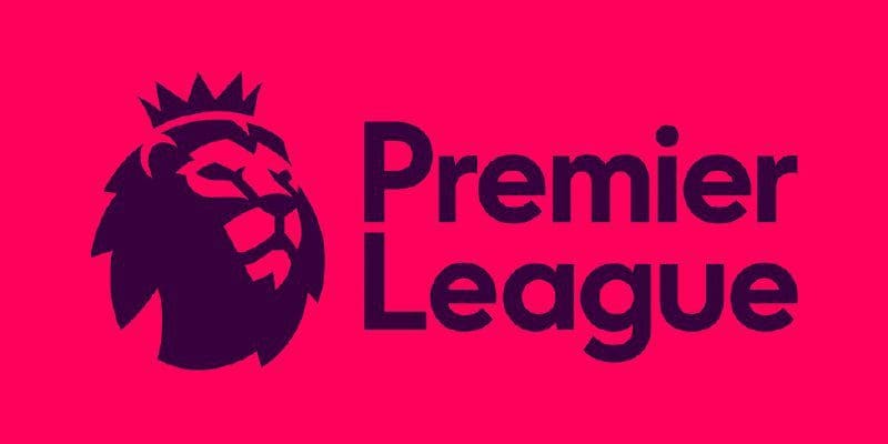
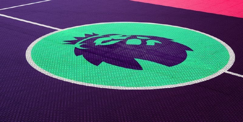
As for the mark (icon), the new identity has taken the bold move of removing the lions body standing on a football. The lack of a ball in the aesthetic is a confident step by the brand as it removes the direct visual correlation between the sport and the brand name. The Premier League is a massive organisation and feel confident enough that they don’t need this to sell the brand. The more geometrical lions head looks better balanced and modern than its predecessor giving the impression of a more forward thinking organisation while maintaining the essence of the original brand.
Typeface
The new typeface is a stark departure from the traditional serif typeface used in every previous carnation of the logo. The Premier League have taken a leaf out of Google’s recent conversion from serif to sans-serif in spectacular fashion. The new font is custom designed and will be aptly known as Premier League. The typeface itself is far more friendly and human than its rigid predecessor. The font is designed to be flexible across all platforms and sizes making it purpose fit for the dramatic shift in technology and the demands it places on design.
Colours
Perhaps the most dramatic element of the change is the use of colour. The existing branding is very corporate and impersonal, while the new palette could be further away from this perception. The electric palette range is more friendly and is meant to promote the brand as more human as opposed to corporate. The colours are part of a plan to shift the brand in the direction of human stories, right up from grass roots to higher up in the game.
Yay or Nay
Despite the mixed reaction online, we feel this rebrand is a huge step in the right direction for logo design. The flexibility, humanity and shear boldness of the rebrand is a brave step in the right direction. The new brand has stayed true to the original logo while being utterly brazen in its choice of typeface and colours. For us Design Studio have taken a huge progressive step in the right direction for design and their contemporaries.
For any more information regarding our article on the New Premier League Logo Design Review or to avail of our services please call Opus Creative on +353 (21) 242 8689 or email us on hello@opuscreative.ie

