
Your business card says a lot about you and your company. It is often the first impression that a potential client or business partner will gain from you. In order to leave a lasting positive impression we have compiled the ‘6 most common business card mistakes to avoid’.
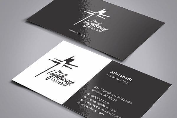
1. Glossy Paper
A lot of businesses use a glossy finish for their business cards with the intention of standing out from their competitors. However a gloss finish on business cards is the most common type of finish provided by most printers. This results in your cards feeling exactly like your competitors. A gloss finish also does not allow you to write any personal notes on cards you may hand out.
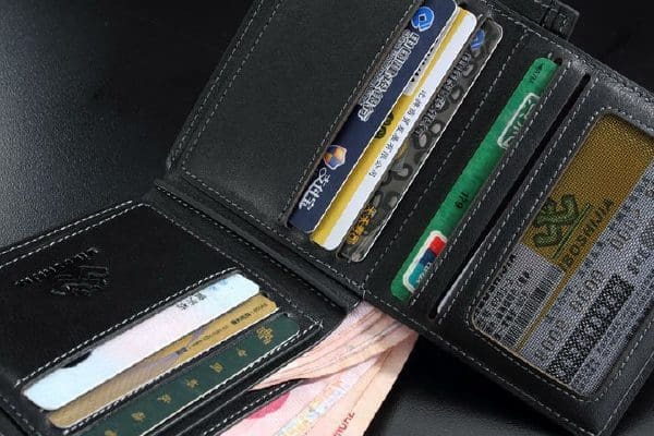
2. Business Card Size
A common mistake made by some companies is deviating form the standard business card size (90mm x 55mm). By making a card larger than this size you risk not being able to fit it in any standard wallet, purse of business card holder. This can lead to your details getting lost by a potential client through bastardised sizing.
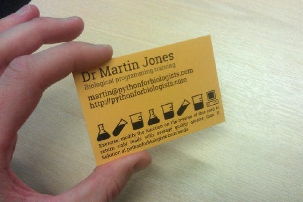
3. Small Text
Using an excessively small font size is a very common mistake in business cards. By being excessively small, you run the risk of clients being unable to comfortably read your details. As a rule of thumb body text should be no smaller that 7 to 8 points in size.

4. Brand Inconsistency
Maintaining a consistency in branding is vital in order to make a good impression on potential clients. It is vital that the logo, fonts, colours and design remain constant across all mediums, both online and in print. A good way to maintain this consistency is hiring the same agency to handle all of the branding or produce brand guidelines for other agencies to where too.
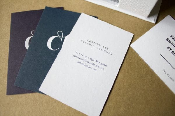
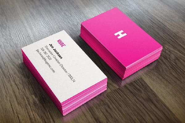
5. Too Much Information
Keeping your business card as simple as possible is a certain way to ensure that people can clearly read your contact details. Explaining what your business does in detail or listing services should be reserved for your website or printed brochure. In order to give off a high level of professionalism, your business card should only have your essential contact details. This should include your logo, name, position, email address, telephone number and website address.
6. White Space is Good
White space is a design term for empty space that should be present on your card. Cramming too much information in to a card does not allow the eye to take in relevant information. The use of white space helps you create a hierarchy of information that is relevant to a potential client.

Bonus Tip – Not Using The Back of the Card
By not using one side of your card to save on printing costs reflects badly on your business. It tells the prospective client that you are cheap. If they think that you would spare costs on a business card, it might indicate that you would do so on the quality of your products or services.
For any more information regarding the ‘6 most common business card mistakes to avoid’ or to avail of our services call Opus Creative on +353 (21) 242 8689 or email us on hello@opuscreative.ie