The most common destination of visitors on to your eCommerce website is the homepage. Your homepage is the first port of call from which to inform your audience who you are and most importantly to convert views into sales. In this article we give you 13 Tips To Make Your eCommerce Website Homepage More Effective.
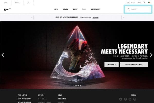
1. Use a Permanently Displayed Search Box
One of the most important features of every eCommerce website homepage is the search option. By locating this search feature prominently throughout the website you enable a client to find your products or services very easily. This ease of use cuts out any unnecessary hassle for a client looking for something very specific.
Image Source: Nike
2. Have an Ever Present Shopping Cart
The shopping cart is where potential product purchases end up when chosen. This section allows the customer to view what they have chosen and pay for these items. It is estimated that up to 25% of all eCommerce users leave the website without purchasing these items, only to return at a later date to complete the purchase. Through the use of cookies these items are saved in the shopping cart. It is vital that the viewer is able to find this list at all times to facilitate purchases.
Image Source: Nike
Statistic Courtesy of Practical eCommerce
3. Have a Well Organised Navigation Bar
One of the main cause of a poor bounce rate (people leaving the website without visiting other pages) is the lack of a coherent navigational menu. By presenting your services or product categories into an organised structure of hierarchy you are making it easier for the viewer to browse what interests them. It is recommend that the navigational menu is positioned along the top or on the left of the page in order to avoid any confusion.
Image Source: Nike
4. Display Your Location or Telephone Number
Gaining the trust of visitors is vital in being able to successfully sell products online. The existence of fraudulent websites has made the public more cautious when making online purchases. In order to gain a visitors trust it is highly recommended that you provide an address or phone number prominently on the site. This tells your audience that you can be contacted in the event of any query and gives the consumer confidence of your websites legitimacy.
Image Source: Enibas
5. Try Not Using a Slider
Sliders are a useful way to display numerous products on your website homepage. However in most cases they have been proven to annoy the viewer rather than help sell specific products or services. Continuous movement, distracting flashes and long loading times are proven turn offs to viewers. In most case it is recommended to display one main slide instead of several alternating slides.
Image Source: Enibas
6. Display Well Known Clients, Partners or Suppliers
Displaying well know brands as partners, clients or suppliers is a proven method to increase your businesses credibility. By associating your business with trusted brands you are essentially telling the viewer that you are important and most importantly you can be trusted.
Image Source: Life Style Sports
7. Have a Sales Section
According to an E-tailing Group study, 47% of online shoppers only buy discounted items. The same study also pointed out that 62% of all online shoppers look for a sales section on each eCommerce website. With this information it is recommended clearing your stock by having a visible sale section on your homepage.
Image Source: Life Style Sports
8. Display Payment Methods
Displaying payment methods on your website is a helpful indicator of payment options for the consumer. This display will save any confusion that the consumer has regarding making purchases and also heightens the websites validity through payment brand association.
Image Source: Life Style Sports
9. Declare Free Shipping
One of the leading causes of consumers abandoning online transactions are high shipping costs. By being able to provide your clients with free shipping where possible you improve your chances of converting a visitor into a customer.
Image Source: Nike
10. Use a Pop-Up Newsletter Subscription
A great way to ensure visitors return to your website is by using a pop-up newsletter subscription form. By getting contact details off the viewer, you can contact them again via email leading to return visits and potential sales. The best way to get these details is by offering something in return .ie enter your details and get 10% off your first purchase, etc.
Image Source: Elegant Themes
11. Use Large Background Images
Using a high quality large image at the top of the homepage can prove to be a clutter free alternative to numerous product offers or information. It helps communicate the brand’s message clearly and the design portrays the website as high-end.
Image Source: Brown Thomas
12. Advertise Your Most Popular Items
By having the most popular items sold displayed on the homepage you can emphasise this demand and create a public hunger for these popular items.
Image Source: Brown Thomas
13. Encourage Social Media Sharing
Giving your online the opportunity to share information on items purses through their social media is a fantastic way to promote future sales from their online connections. By having a like or share option you are encouraging the consumer to promote your website.
Image Source: Nike
Bonus Tip – Have an FAQ
Having an FAQ (frequently asked questions) option on your website is a great way to clear up any confusion potential consumers might have about purchasing your products or services. Usually the FAQ is located on the footer and present through out the website. This option saves having to explain the process via email, chat function or over the phone.
Image Source: Enibas
For any more information regarding the ‘13 Tips To Make Your eCommerce Website Homepage More Effective’ or to avail of our services call Opus Creative on +353 (21) 242 8689 or email us on hello@opuscreative.ie


