Over the last eight years the explosion in popularity of smart phones and tablets have made a huge impact in the way people surf the web. It is now estimated that over 30% of all Irish people use tablet and mobile devices to view the internet exclusively and this number is growing. As a direct impact of this trend, responsive web design has become standard for all websites. Responsive web design allows a website to display information comfortably on any screen size. This is made possible by frameworks such as Twitters Bootstrap. As a direct result of web design having to be responsive, logos also need to be as flexible. In this article we give you the lowdown on the ‘Responsive Logo Design – The Breakdown’.
Image via Joe Harrison
Responsive Logo Design – Why?
The term “responsive logo design” is a relatively new one. Logos always needed to be flexible to fit all size demands, but the introduction of responsive web design and social media have changed everything. In particular small reproductions of a logo need to be legible. The previous solution for this was simply creating a logo that can be reduced in size and still be legible. However with demand to fit your logo in tight spaces such Facebook’s side profile size (42px x 42px) has made this impossible.
As with responsive web design the solution for this issue is to be responsive. If you look at the Walt Disney logo above you will notice that there are four different representations. From left to right, the logo gradually simplifies until you are left with a simple D. These stages simplify the brand aesthetic while maintaining core features in each iteration. This of Responsive Logo Design as an exercise in minimalism while maintaining a brands distinguishing features.
Image via MLS Soccer
Adaptable Logo Design – Why?
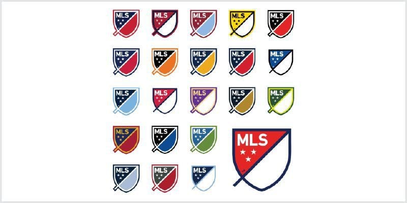
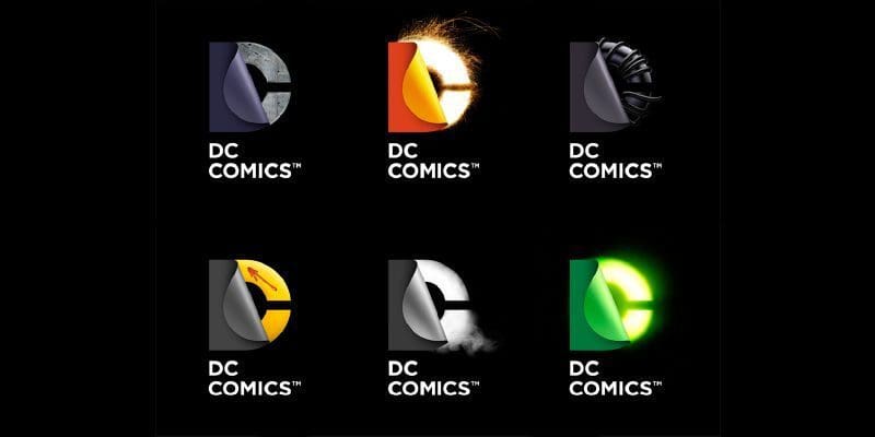
Adaptable logo design is the practice of designing your brand identity to be flexible for potential modifications. For example, Major League Soccer in America recently released its new logo to mark their twenty year anniversary. The design (above) is crafted in such a way that the logo can easily adapted to the colours of all twenty-one Major League Soccer teams, keeping the branding on point. In the last few years DC comics have taken advantage of adaptive logo design to showcase the many franchise characters under the umbrella of the main DC Comics logo. This method of logo design allows companies to expand their visual branding message while staying to true to the company ethos.
Image via Comic Vine
For any more information regarding our article on ‘Responsive Logo Design – The Breakdown’ or to avail of our services please call Opus Creative on +353 (21) 242 8689 or email us on hello@opuscreative.ie
Cover Image via Joe Harrison


