Have you ever looked at something completely differently based on a new piece of information? Logo design is brimming with undiscovered meanings and well executed messages to help persuade the viewer to engage with the brand. In this article we explore ‘Famous Logo Designs with Hidden Messages’ and decode these messages.
1. Toblerone
Toblerone is a famous manufacturer of chocolate owned by Mondelez International (formerly Kraft Foods). Toblerone was originally conceived in a small city in Switzerland called Bern. Bern is famous for its association with bears. The logo mark, the mountain has a hidden illustration of an upright bear to communicate its close association with Bern.
2. FedEx
FedEx is one of the world’s most recognisable shipping companies. The logo itself is famous for it hidden message in the form of an arrow shape in between the negative space existing between the uppercase E and X. The logos designer Lindon Leader described it with the following quote. “The arrow could connote forward direction, speed and precision, and if it remained hidden, there might be an element of surprise, that aha moment.” The FedEX logo has won over forty major awards worldwide with Rolling Stone Magazine describing it as one of the eight best logos of the last thirty-five years.
3. McDonalds
McDonald’s golden arches are one of the worlds most recognisable brand identities. In the 1960’s McDonalds were considering changing the logo, but were convinced to retain the famous golden arches by design consultant and psychologist Louis Cheskin. According to an article from the BBC, Cheskin said that the golden arches unconsciously recognize the logo as “symbolism of a pair of nourishing breasts.”
4. Amazon
Amazon is the world’s largest online retailers and synonymous with selling almost every product a consumer can possibly want. The logo itself has a clever hidden message. It communicates having very product desirable with its arrow going from a to z. This arrow is also in the shape of an inviting smile make representing the brand as both friendly and having a comprehensive amount of consumer goods.
5. Unilever
Unilever are a Dutch-British multinational consumer goods company. Unilever produce a vast catalogue of products including food, beverages, home care products and personal care items. The logo itself is made up of a selection of products from these four main sectors that make up the letter U.
6. NBC
NBC is an American commercial television and radio network that is the flagship property of NBCUniversal, a subsidiary of Comcast. The company is famous for logos hidden meaning. The logo was first used in 1956 and became known as the Peacock Network due to iconic logo mark. Since it’s inception the company has embraced the peacock associated and evolved six tail-feathers that represent each its departments including the News, Sports, Entertainment, Stations, Networks, and Productions. The peacock is also depicted facing the right to symbolise the company looking towards the future.
7. Beats By Dre
Beats by Dre is a headphone and electronics manufacturer endorsed by celebrity music mogul Dr Dre. The company has recently been acquired by Apple in a deal worth three billion dollars. The logo itself portrays the b to represent the word beats and also uses that b to represent a set of head phone from a side profile.
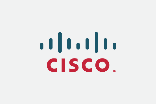
8. Cisco
Cisco Systems Inc is an American multinational technology company. The company designs, manufactures and sells networking equipment. The logo itself has a double meaning. The shape is meant to both communicate the company’s inception in San Francisco through the iconic Gold Gate Bridge and the series of blue lines represent an electromagnet.
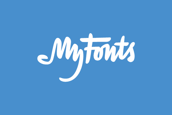
9. MyFonts
MyFonts is an online provider of typographic fonts for online and printing purposes. As a font provider, the company decided to design a custom font to best represent what the company do. The custom script font shows the ‘My’ represented as a hand.
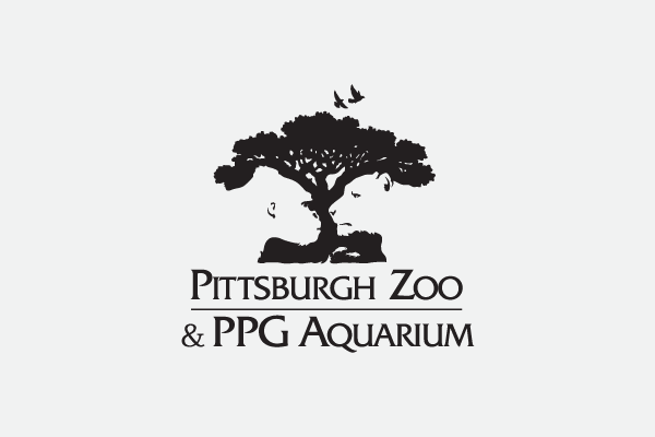
10. Pittsburgh Zoo and PPG Aquarium
The Pittsburgh Zoo is one of only six zoo and aquarium combinations in the USA. The zoo was founded opened on June 14, 1898. It was originally known as Highland Park Zoo, eventually rebranding to the Pittsburgh Zoo and PPG Aquarium. The logo itself is utilises negative space in the design in the contest between the tree and the white gorilla and lioness.
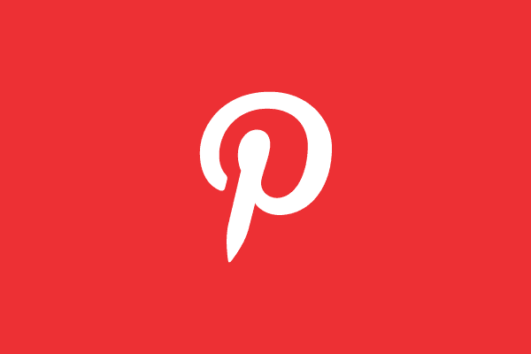
11. Pinterest
Pinterest is world renowned digital pin board site. The website allows its users to take images from the web and place them on a digital board for future references. The logo mark, the P acts as both a letter and a physical pin.The co-design of the logo, Michael Deal, said: “For most of the project, I had avoided making visual reference to the image of a pin because it seemed too literal. But the “P” started to lend itself too well to the shape of a map pin.”
For any more information regarding ‘Famous Logo Designs with Hidden Messages’ or to avail of our services call Opus Creative on +353 (21) 242 8689 or email us on hello@opuscreative.ie


